Demonstration of technical and Visual Skills, Quality of Outcome, Demonstration of Creativity
You’ve identified a topical theme (plastic waste) and approached it in a consistent and methodical manner.
From the contact sheets I can see you’ve tried moving the image around in the frame and settled upon a central composition which firmly situates the object but leaves little room for the eye to move around the scene. Whilst this can be a strategy within your work, consider how changing the angle of view might have led to a different relationship to the object.
I’m thinking here of Andy Hughes’s images of waste from beaches around the world. In one image, a lighter is discarded and left upright in the sand, shot from ground level looking up towards the lighter it becomes a kind of monolith and has an impending sense of doom which echoes Hughes’ concerns as an environmental advocate.
The image of the dead bird is very striking as are some of the more abstract compositions of waste from the beach. It would have been good to change the set up a little and add some visual interest to the series by including some of these.
The dead bird was something I would have liked to use but I didn’t think it would fit in with the theme, especially with the number of images we were able to use. I had been contemplating using it as part of a series on dead wildlife/road kill. However, by changing the emphasis on the project to things that are abandoned means I could utilise the images of the bird as well as some of the images of feral cats that I took in Cyprus. Contrasting things that have been abandoned by man with things that have been abandoned naturally through death, like the bird, or allowing things to get out of control, like the large number of feral cats.
Some of the images look a bit on the dark side and could benefit from some brightening – consider applying a curve and cleaning up some of the yellow/brown tones that spread across the set.
Curves are a really powerful tool for doing this in Photoshop. Have a look through some of Adobe’s online tutorials (beginner > advanced) and find one suitable. Start practicing the application of curves and keep track of before and after shots to see how much better your images becomes once you learn to use them.
The changes I make to images using the curves tool in Lightroom are quite basic so I really need to look at getting more proficient with using tools like this if I’m going to get the best from my photos.
Have you thought much about how you might present or showcase this work and what format would best suit it?
I’d not given thought to how to showcase this work. Contemplating how to showcase it I think I’d want to go down the exhibition route. At the moment I have two sets of images, one from Norfolk, the other from Cyprus. I think it would be good to have another couple of sets of images from other places, preferably countries in order to highlight the global scale of the issue. I also think that continuing with the link to bodies of water: the sea, lakes and rivers, would be a good way to link them together. Taking into account the suggestions above about changing perspective and composition there would be an obvious progression to the images produced.
I also intend to complete a PADI open water diving qualification over the summer and following on from there a 2 day Underwater Photography course, when it’s next run at the diving centre. Diving is something I’ve not done since I was at Polytechnic but it was fun and I enjoyed it. Combining that with my photography seems like a great way to take things forward and add a new element to my work.
Learning Logs
Context
It would be good to see reference to some contemporary examples of photographic work (see recommendations below) and your thoughts in response to it. Beware of reading too many technical/how-to style photography books. Whilst these are helpful in mastering technique, they rarely discuss the wider context of the work produced or the language of photography itself.
I’ve noticed that in recent months I’m picking up more books that highlight the work done by various photographers as well as giving some background to their lives.
I’m currently working my way through Diane Arbus – Revelations, which in addition to a chronology of her work based around her notebooks, letters and other writing, also includes essays concerning the relevance of her work and another on the techniques and methods that she used. This carries on from my earlier interest in Arbus and her work.
I’ve also just finished reading Women War Photographers: From Lee Miller to Anja Niedringhaus, something I picked up after coming across the work of Gerda Taro. I have books about Taro and her relationship with Robert Capa on my current reading list.
Also just added to my reading list is the exhibition catalogue for Mandy Barker’s Altered Ocean exhibition, which I didn’t manage to visit when it was on in Bristol. In September I’ll be visiting the Cindy Sherman retrospective at the National Portrait Gallery as I have to be in London for a workshop related to my day job.
Suggested reading/viewing
Context
Andy Hughes – http://www.andyhughes.net/
Looking at Hughes website and the particularly the projects page (http://www.andyhughes.net/site/projects-2-2/) there are a number of images that leap out at me.
The first is the image of the figure that is surrounded by orange paint splodges. The splodges remind me of caterpillars or millipedes. Looking at this image it reminds me that no matter how great mankind thinks it is, even the smallest of creatures will overwhelm us eventually. We might be able to shape our world to suit us but we all face the prospect of being “worm food” eventually.
The second image that leapt out at me was of the discarded condom. Looking at it reminds me of Lampreys. The abandoned condom could be seen to symbolise how mankind attaches itself to the planet and feeds on it. If we are careful we won’t destroy our host, if we aren’t then we could kill it and then have to find another host to latch on to. Except in our case, we don’t have another host to move on to.
Like the lighter image mentioned in the feedback above, the image of the lightbulb (http://www.andyhughes.net/site/portfolio-2/uncategorized/italy-cities-cultural-heritage-digital-humanities/) shows how changing perspective alters how things appear. I love the way that the curved shape of the bulb mirrors the curved ceiling.
Finally I love the images where Hughes as placed an upside down bottle on a object, like a stick, giving the impression that something is pouring out of the bottle.
I think Hughes’ book Dominant Wave Theory will be something I add to my reading list.
Edward Burtynsky – Anthropocene Project: https://www.edwardburtynsky.com/projects/the-anthropocene-project/
The trailer for Anthropocene: The Human Epoch is interesting and brings the effect that we are having on the world around us, and the creatures that inhabit it with us, home. The final show of the piles of elephant tusks being burned is particularly shocking. How many hundreds of elephants perished just so people could have the ivory from their tusks?
Mandy Barker – Altered Ocean: http://www.rps.org/exhibitions-and-competitions/mandy-barker
I can’t really comment on Barker’s Altered Ocean exhibition. From the little I’ve seen of it, image-wise, it looks impressive. I’ve ordered the exhibition catalogue and am looking forward to viewing the work that she has produced that way.
Dead Bird
I had a bit of time to take another look at the images of the dead bird. In the end I decided that only one of the ones I’d originally used I still liked and two of the images that I’d rejected I preferred.
I’ve included these below.

This is one of the original images I considered using but didn’t include in the final selection. I’ve adjusted the image so that you can see some of the markings.
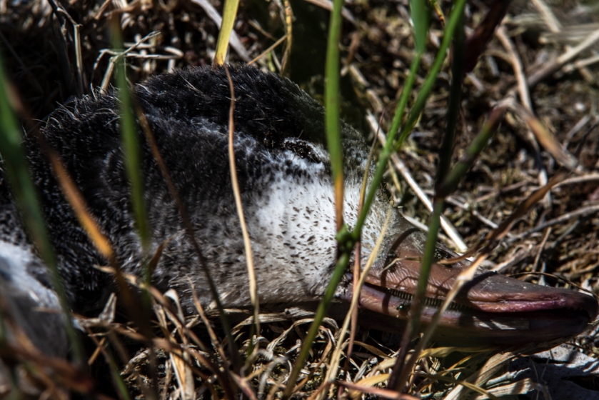
This image was one I rejected initially but on revisiting decided it was better than the full body image. I like this image because it has the whole of the birds head and you can just about make out some of the ants that were crawling on the dead body. Again I adjusted the image so that the white and black flecks are visible.

If I was to select one of these images to use then it would be this one. Although it doesn’t have the full beak and one of the ants from the previous image has moved out of shot, you can still see other ants, particularly the ones that are crawling over the eye area. You might have to look closely to see them, black ants on black feathers don’t stand out massively.
Once again I adjusted the image so that the white flecks among the black are visible. I think the level of detail with the feathers and the inside of the beak are something I’m really happy with and if I was to display this as part of an exhibition then I’d want it to be at least A4 size in order to allow for some of the details to be seen clearly.